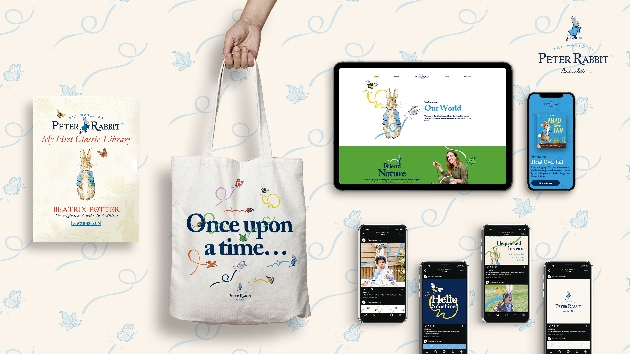
Penguin Random House Children's enlisted design agency CreateFuture to lead the project, drawing on early source material to ensure the updated assets continued to reflect the legacy of the brand. The refreshed logo showcases the iconic Peter Rabbit pose which has been reinterpreted by internationally recognised illustrator Chris Mitchell and now incorporates the title font from the first edition of The Tale of Peter Rabbit, as well as Beatrix Potter's signature. These elements combined act as signifiers of the official and original Peter Rabbit brand.
"Beatrix Potter's exquisite illustrations are themselves timeless and remain perfectly pitched for physical books. We're continually considering how best to translate the illustrations for a variety of applications while retaining their integrity and originality. Alongside developing a new design system that enables us to be visually consistent across all iterations of the Peter Rabbit brand, a refreshed logo fuses past, present and future, by combining the classic bespoke Beatrix Potter typeface with a reinterpreted version of the iconic running rabbit." said Anna Billson, Art Director – Penguin Random House Children's.
The brand tool kit also includes a newly developed design system – Hop, Skip, Jump – consisting of three distinct treatments which can be used to target different audience demographics. Taking inspiration from Beatrix Potter's animal and insect illustrations, a series of graphic trails has been created to add energy and narrative to static images. 'Hop' uses the trails with a soft and muted colour palette, a gentle application for infant sector, whilst at the other end of the spectrum, 'Jump' uses primary colours on clean backgrounds for a high energy, contemporary application.
The outcome is a truly progressive brand refresh that has been authentically informed by the brand's 120-year heritage whilst simultaneously enabling Peter Rabbit to appeal to contemporary family audiences and a new generation of fans.
View more at www.peterrabbit.com